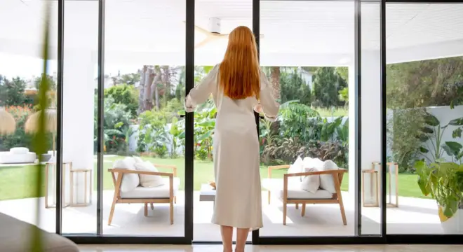
Small Room? Skip These 5 Paint Colors and Try These Instead
I’ve spent years helping homeowners and renters make small spaces feel open and inviting, and one lesson keeps coming up: paint color matters more than most people realize. Pick the wrong shade, and your cozy little room can suddenly feel cramped, dark, or downright claustrophobic. You don’t need me to tell you how frustrating that can be when every inch of space counts.
In this article, I want to show you five common paint colors that actually shrink small rooms—and, more importantly, smarter alternatives that make your space feel brighter, airier, and more welcoming. By the end, you’ll not only know which colors to avoid but also have a clear strategy for choosing shades that play to your room’s strengths. Let’s get into it.
Understanding the Wrong Kind of Colors for Small Rooms
You might think any neutral shade is a “safe bet” for a small room, but that’s not always true. Some colors can quietly make your space feel smaller without you even noticing at first. I’ve seen it happen countless times: a room that should feel cozy ends up feeling boxed in because the color is working against the space.
Here’s why it happens:
- Light absorption – Darker or overly cool shades soak up natural and artificial light, leaving the room looking dull and smaller than it really is.
- Shadow emphasis – Certain colors, especially cool grays, highlight shadows along corners and edges, making walls feel heavier and more closed in.
- Contrast breaks – High-contrast walls, ceilings, or trims can visually “cut” the room, breaking it into smaller chunks rather than letting it flow as one space.
Take gray, for example. You might see it everywhere and think it’s neutral, modern, and harmless—but if your room has limited natural light, it can make the space feel flat or even gloomy. Experts like Martha Stewart point out that cool grays, in particular, tend to emphasize shadows and flatten walls rather than expand them naturally.
By understanding these visual principles, you start to see why some “popular” colors aren’t actually helping your small room. Once you know what to avoid, you’re in a much better position to choose shades that truly open up your space.
The 5 Paint Colors That Shrink Small Rooms
I’ve seen so many small rooms struggle with the wrong paint choice. Some colors sneakily make the space feel cramped, and the tricky part is that they’re often popular or “trendy.” Let me walk you through five shades to watch out for—and what you can do instead.
1. Medium to Cool Gray
- Why it shrinks: Cooler grays emphasize shadows and flatten walls, which can make a small room feel heavier and less inviting.
- Alternative: Choose a warmer off-white or soft greige. These shades bounce more light around the room, instantly making it feel airier.
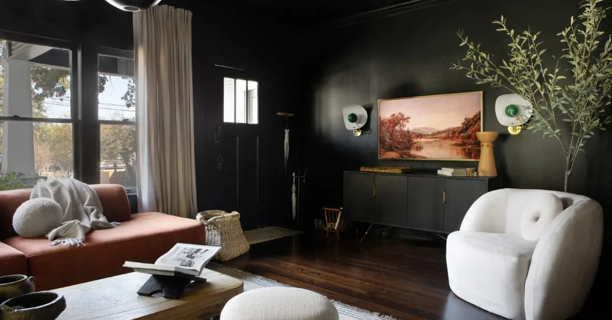
2. Black and Charcoal (Pure Low-Chroma Dark Neutrals)
- Why it shrinks: Very dark hues swallow the room’s natural brightness, turning a compact space into something that feels much smaller than it is.
- Alternative: Deep jewel tones like navy, forest green, or burgundy can give drama and depth without closing in the room.
3. Burnt Umber / Rich Earthy Brown
- Why it shrinks: Dark reddish-brown tones absorb a lot of light, weighing down a small space and making it feel heavy.
- Alternative: Softer shades of terracotta, peach, or coral reflect more light and keep the room feeling open and warm.
4. Bright, Saturated Red or Primary Bright Colors
- Why it shrinks: Highly vivid colors can overwhelm a small room, crowding the walls visually and making the space feel busy.
- Alternative: Use bold reds or primary tones as accents on a single wall, shelf, or trim, then pair them with lighter neutral walls to keep the room feeling balanced. You can see some examples of colors designers suggest avoiding in small spaces on Livingetc.
5. Terracotta (Deep, Rich Clay Tones)
- Why it shrinks: While warm, rich terracotta shades are very saturated and absorb light, which can make walls dominate a compact layout.
- Alternative: Opt for muted peach, coral, or light clay tones to get the warmth without the heavy, closed-in effect.
By understanding these color traps, you can make small rooms feel much bigger and more inviting—without giving up personality or style. I always tell my clients: it’s not just about avoiding the “wrong” colors; it’s about choosing alternatives that work with your room’s light and vibe.
Why Some Dark Colors Actually Work in Small Rooms
It might feel counterintuitive, but dark colors don’t always shrink a room—they can actually add depth and character if used smartly. I’ve found that understanding a few design tricks can completely change how a small space feels.
One method designers love is the “blurred edges” trick. By painting walls in a rich, saturated dark color and keeping trim or ceilings lighter, the edges of the room recede visually. This creates the illusion of depth and makes the space feel intentional rather than boxed in.
Here’s what works best:
- Rich, saturated tones like deep navy, forest green, or burgundy can anchor a room and make it feel cozy without shrinking it. Avoid flat black or grayish shades that absorb too much light.
- Strategic placement: Use darker walls on the back or focal side of the room to “push” the space back, while keeping other walls lighter for balance.
- Designer-approved examples: Many interiors show jewel tones used on one accent wall or throughout small rooms with thoughtful lighting, adding character without making the room feel cramped. You can read more about this approach on Yahoo Lifestyle.
When used carefully, dark colors can make a small room feel intentional, stylish, and cozy instead of closed in.
How to Choose the Right Paint for Small Rooms: Smart Guidelines
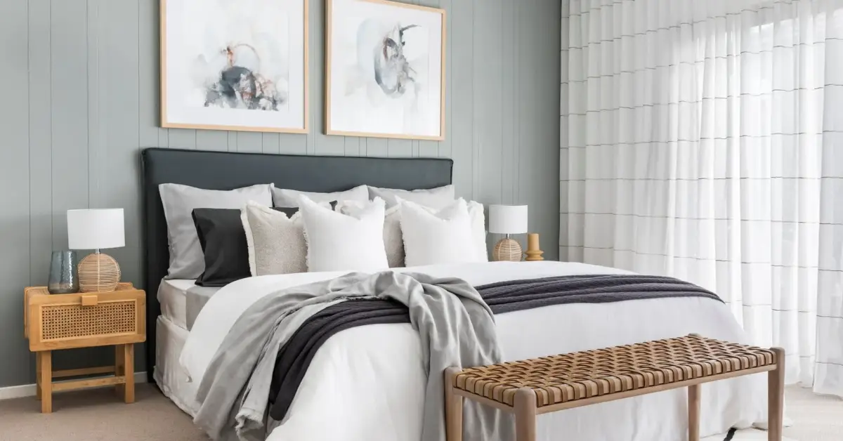
Choosing paint isn’t just about picking a pretty shade—it’s about understanding how color interacts with light, walls, and your furniture. I always tell clients that a small room benefits from a few strategic considerations:
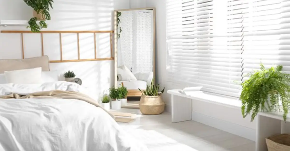
- Lightness Matters – Check the Light Reflectance Value (LRV). Higher LRV means more light bounces around, making the room feel bigger and brighter.
- Undertone Strategy – Warm vs. cool undertones dramatically change how a space feels. Warm neutrals usually work better in tight spaces, while cool grays can feel heavier.
- Sheen Matters – Finishes like satin or semi-gloss reflect light and add depth. Experts at Benjamin Moore recommend higher sheen in small rooms to make the space feel airier.
- Accent Wisely – Bold or dark colors should be used sparingly—think accent walls, shelves, or furniture pieces—so the room doesn’t feel overwhelmed.
- Test First – Always sample paint in your actual room and under different lighting conditions. Before you commit to a color, it’s also worth checking out 10 hidden spots in your home that desperately need a paint refresh—you might discover areas that could influence your overall color choice. Walls can look completely different at morning, afternoon, and evening light. Following Benjamin Moore’s advice, I suggest ordering swatches before committing.
By keeping these guidelines in mind, you can confidently choose shades that enhance your room’s strengths instead of hiding them.
Practical Tips + Design Hacks to Pair With Better Color Choices
Choosing the right paint is just the first step. I’ve learned that a few smart design moves can really make your small room feel larger than it actually is.
Here’s what I recommend:
- Use mirrors and lighting strategically – Place mirrors opposite windows or light sources to reflect natural light and create a sense of depth.
- Paint trim, ceiling, or built-ins in complementary light tones – This “blurs” the edges of the room, so walls feel less boxed in and more continuous. If you’re painting walls near windows or built-ins, make sure nothing gets stuck or damaged—here are 7 easy ways to unstick a painted-over window without damage that can save your trim and glass.
- Keep décor and furniture minimal and scaled appropriately – When your walls are doing the work to expand the space visually, too much clutter or oversized furniture can undo that effect.
- Try color drenching – Using the same or very similar color on walls, trim, and even cabinetry reduces visual breaks and helps the room feel more open and cohesive.
These small design tweaks work hand-in-hand with smart color choices to create rooms that feel bright, airy, and intentional. And while you’re optimizing your room with mirrors, trim, and light tones, don’t forget to keep your walls spotless—check out these 8 genius ways to remove scuff marks from your walls without damaging paint to maintain a fresh, open feel.
Summary & Action Plan
Let’s bring it all together. If you remember nothing else, here’s the key takeaway:
- Avoid colors that shrink small rooms: medium/cool grays, black/charcoal, burnt umber, bright reds, and deep terracotta.
- Instead, opt for warm neutrals, soft greiges, muted peaches/corals, and rich jewel tones where appropriate.
- Keep in mind the principles that matter: Light Reflectance Value (LRV), undertones, and sheen—these can dramatically change how a room feels.
- Pair your paint choices with practical design hacks like mirrors, complementary trim, and minimal décor to maximize space.
- Always test samples in your room, and don’t hesitate to ask your friends, family, or design communities for feedback.
I’d love to hear from you—what’s the color in your small room that you wish you hadn’t chosen? Or maybe you’ve tried a tip from this guide that made a huge difference? Share your experience in the comments below, and if you want more actionable guides like this, visit Build Like New for tips on painting, decorating, and making every space feel bigger and better.
Disclaimer: This article is for interior design guidance and inspiration only. Paint colors may appear differently depending on lighting, room size, and personal perception. Always test samples in your space before making final decisions.