10 Expert Secrets to Pick Wall Art That Elevates Any Room
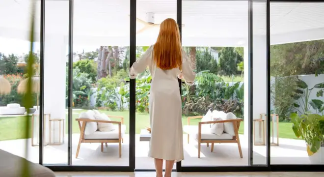
I’ve spent years walking into homes where the walls just… didn’t feel right. You know that feeling—the room is clean, the furniture is beautiful, but somehow it lacks soul. That’s where wall art comes in. Choosing the right pieces can completely change how a space feels, making it warmer, more inviting, and unmistakably yours.
When I first started curating art for my own home, I realized it’s not just about picking a pretty picture. The size, placement, color, and even the story behind the piece all matter. A well-chosen artwork doesn’t just decorate a wall—it anchors a room, sparks conversation, and reflects your personality.
In this guide, I’m going to share 10 insider tips that go beyond the generic “pick something you like.” These are strategies I’ve used personally and seen in expert homes that consistently transform interiors. By the end, you’ll feel confident knowing how to select art that truly elevates your space—and maybe even sparks a little joy every time you walk into a room.
So, are you ready to turn your walls into statements? Let’s dive in.
Tip 1 — Consider the Space: Size, Scale, and Architecture
When I look at a blank wall, the first thing I notice is the space itself. A huge canvas on a tiny wall can feel overwhelming, while a small piece on a large wall can get lost. The key is to let the size, ceiling height, and furniture proportions guide your choice.
Here’s what I usually check:
- Measure the wall and note the width and height.
- Compare the artwork size to the furniture below it—ideally, art should cover about two-thirds the width of a sofa or console.
- Consider vertical space—tall ceilings allow for larger pieces or stacked arrangements.
Doing this prevents your art from looking awkward or out of place. It’s all about making the art feel intentional, not random. If you want to make sure your artwork feels fresh and modern, you might also want to check out common decor mistakes that can make a home look dated. For more detailed guidance on proportion and placement, I often refer to tips from Martha Stewart’s decorating rules of thumb.
Tip 2 — Match Art to Room Purpose and Mood

Next, I think about the purpose of the room. Art isn’t just decoration—it sets the mood. For example:
- In the bedroom, I pick calming, softer tones that help me relax.
- In the living room, I sometimes go for bold, energizing pieces that spark conversation.
- For entryways or hallways, I like pieces that make a statement immediately without overwhelming the space.
When you choose art that aligns with how you use the room, the space feels cohesive and intentional rather than thrown together. It’s amazing how a single well-chosen piece can change the energy of a room.
Tip 3 — Define Your Color Strategy
Color is one of the easiest ways to tie a room together—or throw it off entirely. I always consider:
- Complementary colors that enhance the existing palette.
- Contrasting pops for interest without chaos.
- Using accent colors from cushions, rugs, or other decor to anchor the artwork.
A few simple tricks I use:
- Pull one color from the room and repeat it subtly in the art.
- Avoid matching everything too literally—it can feel flat.
- Mix textures and tones to give depth to the visual experience.
When you define a clear color strategy, you avoid clashing or bland interiors, and the art feels like it belongs rather than being an afterthought.
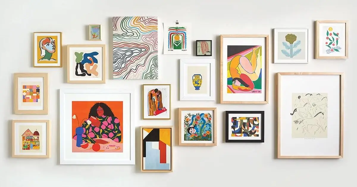
Tip 4 — Placement & Proportion Rules
Once I’ve picked a piece, the next step is where to put it. Even the most beautiful artwork can feel off if it’s hung too high, too low, or too close to other pieces. I follow a few simple rules:
- Hang art around eye level, usually 57–60 inches from the floor to the center.
- Leave consistent spacing when creating a gallery wall—2–4 inches between frames usually works best.
- Consider symmetry versus asymmetry depending on the room’s layout. A symmetrical arrangement feels formal, while an asymmetrical one adds a relaxed, dynamic vibe.
These small adjustments make a huge difference—art suddenly feels purposeful, and the room instantly looks more polished. For detailed advice from experienced interior designers, I like checking tips shared by experts on Artsy about buying and placing art.
Tip 5 — Choose Art With Personal Meaning
Here’s where I get really selective: the story behind a piece. I’ve learned that art that resonates emotionally will always feel more impactful than something trendy. When choosing, I ask myself:
- Does this piece make me pause or feel something?
- Will I still enjoy it in five years, or is it just a passing fad?
- Does it reflect my personality or the vibe I want in the room?
Bullets for making it practical:
- Mix personal favorites with curated finds from galleries or local artists.
- Don’t be afraid of unconventional choices—they often become conversation starters.
- Include one or two bold statement pieces rather than covering every wall.
Pairing meaningful art with small, personal touches around your home can make every space feel truly yours. When you select art with meaning, it transforms the room from a display space into a reflection of you.
Tip 6 — Mix Mediums and Styles
Finally, I like to layer different types of art. Combining paintings, photography, prints, and even three-dimensional pieces brings depth and interest to a room. I usually:
- Mix textures—canvas, metal, wood, and textiles—to keep the wall from feeling flat.
- Combine modern and classic pieces for contrast without clashing.
- Keep some thematic continuity, like colors or subject matter, to maintain cohesion.
Practical bullet tips:
- Start with a dominant piece and then build around it with smaller complementary works.
- Experiment on the floor before hanging—moving pieces around helps visualize balance.
- Don’t overcrowd the wall; negative space is as important as the art itself.
This approach makes your space feel curated and intentional. You’re not just decorating—you’re telling a story with every piece.
Tip 7 — Light Your Art Correctly
I can’t stress enough how much lighting changes the way art looks. I’ve seen pieces that seemed dull at first, only to pop beautifully under the right light. Here’s how I approach it:
- Use soft, directional lighting to avoid glare and shadows.
- Take advantage of natural light, but be mindful of direct sunlight that can fade colors.
- Consider picture lights or track lighting for statement pieces or gallery walls.
Bullets for quick implementation:
- Check the room at different times of day to see how natural light affects the piece.
- Avoid fluorescent overhead lights—they can distort colors.
- Use dimmers for adjustable mood lighting.
Proper lighting makes your art feel alive and ensures every detail stands out. For inspiration on how lighting can enhance interiors, I often refer to the practical tips shared by Wakefit on selecting wall art for each room.
Tip 8 — Build Cohesion Across Rooms
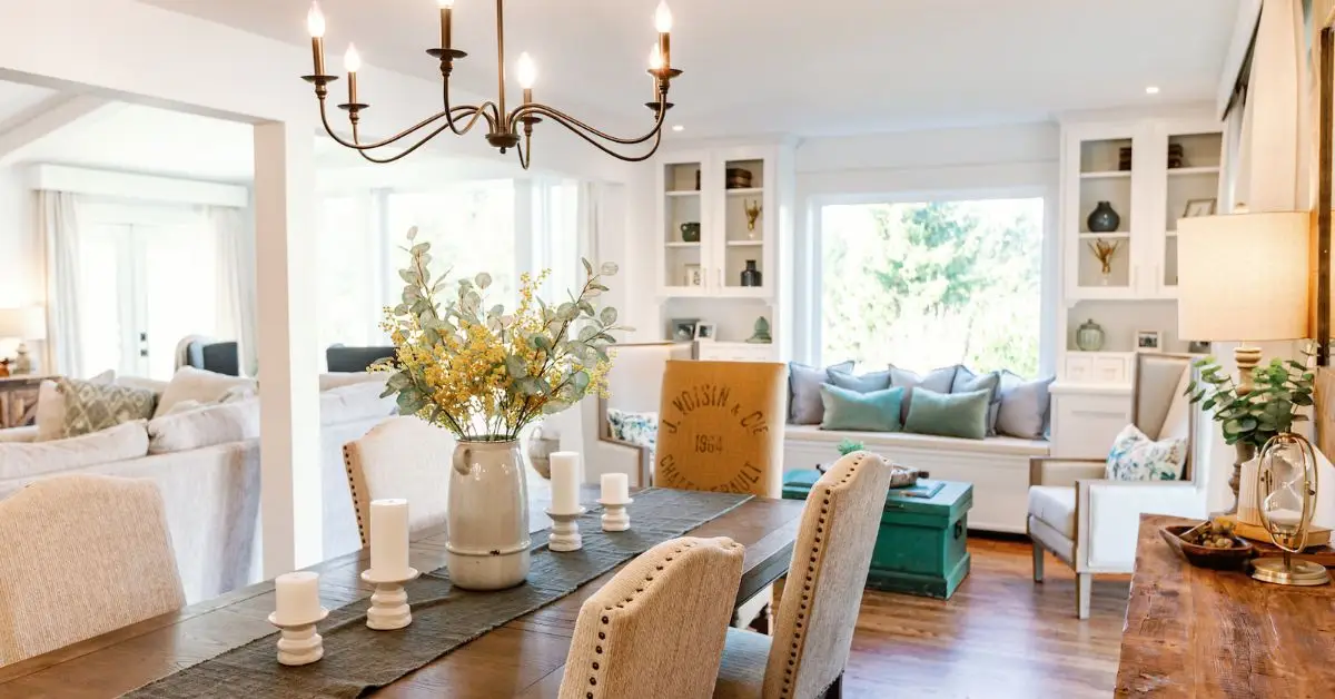
One mistake I see a lot is treating each room as completely separate. Your art should tell a story throughout your home, connecting spaces visually and emotionally.
- Repeat subtle color tones or textures from one room to another.
- Choose pieces that complement the overall style—modern, rustic, boho—without being identical.
- Use smaller artworks or accents in transitional areas like hallways to create flow.
Practical tips:
- Take photos of rooms before buying new pieces to visualize how colors and styles will interact.
- Stick to 1–2 recurring elements (color, material, or theme) to avoid a disjointed look.
This creates a sense of harmony, making your home feel thoughtfully curated rather than random.
Tip 9 — Budget Smart: Mix High-End and Affordable Finds
I know budget can be a concern, but it doesn’t mean you have to compromise on style. I’ve learned to mix splurges with smart finds for maximum impact:
- Invest in one statement piece per room that anchors the design.
- Complement it with smaller, affordable art from local artists, prints, or even DIY pieces.
- Hunt for deals online or in second-hand shops—unique pieces often come at great prices.
Quick bullets for practical use:
- Prioritize spending on pieces you’ll love long-term.
- Rotate affordable artwork seasonally if you like variety.
- Frame prints yourself to save money while maintaining a polished look.
By mixing high-end and budget-friendly options, you get a curated, stylish look without overspending.
Tip 10 — Avoid Common Mistakes and Use a Pre-Purchase Checklist
I’ve seen it happen too many times—people rush to buy a piece of art, only to regret it later. Before purchasing any piece, I also recommend keeping an eye out for red flags in home decor buying to avoid regret later.
To make sure your walls feel intentional, I follow a simple checklist before committing:
- Measure twice: Compare the wall space and furniture size.
- Test colors: Hold a sample against the wall under different light.
- Consider meaning: Does this piece resonate with you or the room’s vibe?
- Frame quality: A simple, well-chosen frame can elevate even an affordable print.
By running through this checklist, I avoid mistakes like oversizing, mismatched colors, or impulse buys. It keeps the focus on creating a space that feels cohesive and personal.
Closing Thoughts — Curate Your Home With Confidence
Choosing wall art is more than decoration—it’s a chance to tell your story and transform your space. When I carefully consider size, placement, color, lighting, and meaning, every room suddenly feels purposeful and alive.
Remember: the best homes aren’t just stylish—they reflect the people who live in them. Take your time, trust your instincts, and let your walls speak.
Before you go, I’d love to hear from you: Which tip are you excited to try first? Drop a comment below—I read every single one. If you want more ideas and inspiration on transforming your home, check out Build Like New for guides, tips, and real-life projects that bring spaces to life.
Disclaimer: The tips and advice in this article are based on personal experience and expert insights. Results may vary depending on your space, style, and preferences. Always measure carefully and consider your own taste before purchasing or installing any artwork.